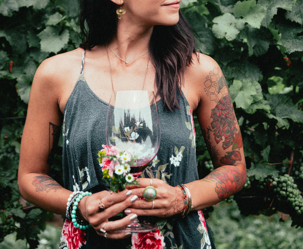
How to Create a Vintage Look in Lightroom Mobile (Quick Guide)

A vintage look can turn simple photos into soft, warm images that feel timeless in Lightroom Mobile, giving your edits a calm and classic style in seconds. This editing style works well because it uses light control, color balance, and texture changes that shape mood, especially for portraits and outdoor shots with natural light, which feel natural.
Then, you get photos that carry a nostalgic feel and stronger storytelling, helping your images stand out on social feeds without heavy editing or complex tools required for beginners. Now follow the simple steps in Lightroom Mobile to build this look, starting with light adjustments and moving through color and grain for a complete result finish process.
Why the Vintage Look Works So Well
The vintage look feels soft and warm. It brings a calm mood to photos. It also adds a sense of memory and time. Many people like it because it feels natural. It does not look too sharp or too bright. It has gentle tones that feel easy on the eyes.
This style also works with many types of photos. Portraits feel more personal. Street shots feel more real. Even simple outdoor photos gain more depth. Light and color play a big part here. Faded contrast, warm tones, and soft shadows help create that old-photo feel. These small changes shift the mood without changing the story of the image. Social media also plays a role. Vintage-style photos stand out in a feed full of bright and heavy edits. They feel different without trying too hard.
What You’ll Need
You only need a few things to start. Nothing complex. First, a phone with Lightroom Mobile installed. It works on most Android and iPhone devices. Open the app and sign in. Next, a photo to edit. Pick an image with good light. Outdoor photos often work best for a vintage style.
You will also need a basic idea of the look you want. Vintage styles can feel warm, faded, or soft. Some look slightly faded with low contrast. Others feel warm with light grain. A stable internet connection can help if you need to download presets or sync edits. That is all you need to get started.
Step-by-Step Guide to Creating a Vintage Look
This part walks through the full edit in Lightroom Mobile. Each step builds the vintage style little by little. Stick to the order for better control over the final result.
Step 1. Start With the Light Panel
Once you open your photo in Lightroom Mobile, go straight to the Light panel. This sets the base for the full vintage style.
Here are the exact adjustments I used:
-
Exposure: -0.20 — Slightly lowers brightness for a softer base
-
Contrast: -25 — Reduces harsh digital sharpness
-
Highlights: -30 — Pulls back bright areas for a faded sky feel
-
Shadows: +35 — Opens dark areas for a soft, lifted look
-
Whites: -20 — Keeps bright tones under control
-
Blacks: +30 — Fades deep blacks for a film-style wash
These settings create a soft starting point. The image already begins to feel less digital and more aged.
Step 2. Add a Gentle Fade With the Tone Curve
Next, open the Tone Curve panel. This is where the vintage fade starts to appear more clearly.
Here is what I did:
-
Lift the black point slightly at the bottom left
-
Drop the white point a little at the top right
-
Create a very soft S-curve in the middle
This reduces the strong contrast and gives the image a faded film look. The shadows feel lighter, and highlights lose their harsh edge. The result is a calm, aged tone.
Step 3. Warm Up the Colors
Now move into the Color panel. This step builds the nostalgic warmth that vintage photos often have.
Here are the color settings I used:
-
Temp: +12 — Adds a warm golden tone
-
Tint: +5 — Slight push toward magenta for a film feel
-
Vibrance: -8 — Softens modern color strength
-
Saturation: -12 — Reduces overall color intensity
These changes make the image feel warmer and less digital. The colors become softer and more natural, like older printed photos.
Step 4. Create Classic Vintage Colors With HSL
Open the Color Mix (HSL) section next. This step controls each color separately and shapes the vintage palette.
Here are the adjustments I used:
-
Red: Hue 0, Saturation -10, Luminance +10 — Softens strong red tones
-
Orange: Hue -5, Saturation -15, Luminance +15 — Smooth skin tones and warm highlights
-
Yellow: Hue -15, Saturation -25, Luminance +10 — Pushes yellows into soft amber tones
-
Green: Hue -20, Saturation -35, Luminance +5 — Turns greens into muted olive shades
-
Blue: Hue -10, Saturation -25, Luminance -10 — Fades skies and cool areas
-
Purple: Saturation -20 — Reduces modern digital color pop
-
Magenta: Saturation -15 — Keeps tones soft and controlled
These adjustments remove strong modern colors. The image starts to feel older and more film-like.
Step 5. Add Film-Style Grain
Now head into the Effects panel. This is where the photo gains texture and realism.
Here are the settings I used:
-
Grain: 28 — Adds soft film texture
-
Size: 35 — Keeps grain fine and natural
-
Roughness: 60 — Adds slight variation for a real film feel
-
Clarity: -10 — Softens harsh edges
-
Texture: -10 — Smooths fine details
-
Dehaze: -5 — Adds a light atmospheric softness
-
Vignette: -18 — Darkens edges for a framed vintage look
The grain brings back the feeling of an old film. The softness makes the image less digital and more organic.
Step 6. Finish With Color Grading
Now move into Color Grading for the final mood balance. This step blends tones across shadows, midtones, and highlights.
Here are the adjustments I used:
-
Shadows: Add cool blue tone (low strength) — Brings soft contrast
-
Midtones: Warm orange tone — Keeps natural warmth in the center
-
Highlights: Light yellow tone — Adds soft glowing light areas
-
Balance: Slightly toward highlights — Keeps warmth more visible
This final step ties everything together. Warm and cool tones mix gently, giving the image a true vintage film feel.
Optional Enhancements for a Stronger Vintage Look
Grain adds a film feel. It breaks the clean digital look. A small amount works best. Too much can make the photo look rough. Fade brings soft shadows. Blacks lose deep contrast. The image feels older and lighter.
Color shift changes mood. Warm tones give an aged look. Slight green or yellow tones can also work well. Split tones can shape style. Add warm highlights. Add soft cool shadows for balance. Light blur can soften edges. It makes the photo feel less sharp. This works well for portraits and outdoor shots.
Before and After Ideas
A vintage edit changes the mood of a photo. It takes a clean image and gives it an old film feel. Start with a normal photo. Bright colors and strong contrast often show in the original. Skin tones may look sharp. Shadows can feel deep and harsh.
After the edit, the photo feels softer. Colors shift to warm tones. Reds, yellows, and browns stand out more. Blacks turn lighter. Whites lose some brightness. The whole image feels faded in a gentle way.
Here are a few simple ideas:

-
Before: bright daylight photo
After: soft, warm light with faded contrast

-
Before: sharp modern portrait
After: smooth skin tones with light grain

-
Before: high color saturation
After: muted colors with a slight yellow tint

-
Before: deep shadows and strong contrast
After: lifted shadows and soft edges
Small changes create the full effect. Lower clarity. Add light grain. Warm up the tones. Pull back the highlights.
Each step brings the photo closer to a classic film style.
Common Mistakes to Avoid
Too much grain can make photos look rough. Fine detail gets lost fast. Heavy fade on the curve lowers contrast too far. The image starts to look flat. Strong warm tones can push skin colors too orange. The photo loses balance. Overuse of vignette pulls focus in a harsh way. The edges feel dark and heavy.
High saturation makes colors look fake. The vintage style feels less real. Deep shadows without control hide important details. The photo becomes hard to read. Too much contrast creates a harsh look. Vintage style needs softer tones. Small edits often work better. Gentle changes keep the mood natural.
Quick Vintage Preset Settings
Start with light adjustments. Lower the brightness a little. Keep the image soft instead of sharp and bright. Move to contrast. Reduce it slightly for a faded feel. This helps the photo look less modern. Adjust highlights. Pull them down so bright areas are not too strong. Shadows can stay a bit lifted to keep detail visible. Warm up the tones. Add a slight yellow or orange tint. This gives the photo an aged color feel.
Shift the colors. Reduce saturation a little. Keep colors soft, not bold. Add a small amount of grain. This brings a film-like texture. Keep it light so it does not look rough. Finish with a gentle fade. Lift the blacks a bit. This makes dark areas look soft instead of deep and harsh. These simple steps set the base for a vintage look in Lightroom Mobile.
Final Notes
The vintage look in Lightroom Mobile relies on soft light, muted color, and gentle contrast. Small changes shape the full style. Nothing needs heavy editing. Light settings set the base. Lower contrast and lifted shadows create a faded start. Highlights stay controlled for a calm feel. Color settings guide the mood. Warm tones bring a soft, aged feel. Lower saturation keeps colors simple and natural.
The tone curve adds a light fade. Blacks lift slightly. Whites drop a bit. The image starts to feel less sharp and more classic. Grain adds texture. It gives the photo a film feel. A light amount keeps detail while adding character. Color grading brings balance. Warm and cool tones work together. The image gains depth without strong contrast. Small edits work better than great changes. Each step builds a smooth vintage style that feels soft and steady.
FAQs
What makes a vintage look in Lightroom Mobile?
A vintage look uses soft light, low contrast, and warm colors. It also adds a faded feel and light grain.
Do I need presets for a vintage edit?
No presets are needed. Manual edits in light, color, and effects give full control over the look.
Which photos work best for a vintage style?
Outdoor photos with natural light work well. Portraits also fit this style. Simple backgrounds help the effect stand out.
How much grain should I use?
Use a small to medium amount. Light grain keeps the photo soft and film-like without losing detail.
Why does lowering contrast help?
Lower contrast creates a faded look. It removes harsh edges and makes the image feel older.
Can I use strong colors in a vintage edit?
Strong colors do not fit this style. Lower saturation keeps the photo calm and more natural.
Why do my vintage edits look too flat?
Too much fade or low contrast can cause that. Adding small tone curve changes and light color balance can fix it.
Is color grading needed for a vintage look?
Color grading helps shape the final mood. It blends warm and cool tones for a balanced film style.