How To Make Photos Look Like Film In Lightroom

Many digital photos can look sharp but lack character. This makes images feel flat or lifeless, especially when you want a nostalgic, cinematic vibe. It can be frustrating to try editing manually and never get the look just right.
Luckily, Lightroom gives you the tools to transform your shots. By adjusting tones, colors, and textures, you can create photos that feel like classic film. This guide will show you how to achieve the film look step by step, explore popular film styles, and avoid common editing mistakes. Soon, your digital images can capture the charm and depth of real film photography.
What is the film's look?
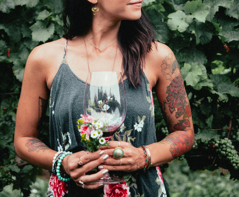
The film look is a style that makes digital photos feel like they were taken on traditional film. It often shows soft colors, gentle contrast, and a natural grain. Whites are less harsh, and blacks are not completely dark. Photos may feel warm, moody, or nostalgic. This style is not about copying film exactly but about capturing its character. It gives images a timeless feel. Many photographers use it to make their work stand out and feel more personal.
The film also emphasizes natural tones. Skin looks smooth and true to life. Landscapes feel calm and balanced. Even ordinary scenes can appear artistic. Small changes in color and light can make a big difference.
Why Photographers Love the Film Look
Photographers love the film look because it adds emotion and depth. Colors are softer and less artificial. Highlights and shadows are balanced, creating a calm feeling. Photos often tell a story without extra effects. The look works for portraits, street photography, and landscapes alike.
Another reason is its timeless quality. Digital photos can sometimes feel sharp or clinical. The film's look brings warmth and familiarity. It can make new images feel like memories. Many photographers also enjoy the creative challenge. Reproducing film digitally takes thought and skill, which makes the results rewarding.
Understanding the Film Look
To recreate the film look, it helps to study how film reacts to light and color. Film usually softens bright areas and lifts shadows. This creates a gentle balance across the image. Colors are muted but still pleasing. Reds, greens, and blues feel natural, not over-saturated. Grain is part of the style, too. It adds texture that makes photos feel real and tactile.
Different film types have unique traits. Some have more contrast, others more warmth or softness. Learning these differences helps photographers choose the right style for each photo. Understanding the film look is not just about editing; it’s about seeing photos differently. Light, tone, and color become part of the storytelling.
Choosing the Right Photo for a Film Edit
Not every photo works well with the film look. Choosing the right image makes the effect stronger and more natural. Photos with simple lighting often look best. Too many bright spots or harsh shadows can make the style feel uneven.
Portraits with soft light usually work well. Faces remain smooth, and colors feel warm. Outdoor shots with even light can also benefit. Landscapes, city streets, and quiet moments often evoke a nostalgic or calm feeling.
Pay attention to color and contrast. Images with strong, natural tones are easier to edit. Photos with extreme colors or blown-out highlights may not respond well to the film style. Texture matters too. Scenes with visible details, like leaves, fabric, or clouds, can make the grain effect feel more realistic.
Finally, think about the mood. The film looks best on photos that tell a story or capture a feeling. Simple scenes with clear subjects are often the most effective. This way, the edit enhances the image rather than distracting from it.
Step-by-Step Guide to Creating a Film Look in Lightroom
Creating a film look in Lightroom is easier than it seems. By adjusting contrast, colors, and textures, you can give your photos a timeless feel. Follow these steps to get a natural film-style effect.
Step 1 – Start With a Flat Base Edit
Lower the contrast and reduce highlights. Brighten shadows slightly. This creates a neutral starting point for your photo. Adjust exposure if needed to balance the overall image.
Step 2 – Lift the Blacks and Soften the Highlights
Raise the blacks to create a faded effect. Reduce highlights so that bright areas are not harsh. These small changes make the photo feel soft and natural, like classic film.
Step 3 – Add Film Grain
Go to the Effects panel and add a small amount of grain. Keep it subtle for a natural look. Grain adds texture and gives the image a real film feel.
Step 4 – Adjust the Tone Curve
Use the Tone Curve to shape contrast. A slight “S” curve adds gentle contrast. Lifting the shadows creates a faded look. This step sets the mood of your photo.
Step 5 – Shift Colors Using HSL
Open the HSL panel to adjust Hue, Saturation, and Luminance. Make small tweaks to mimic film colors. For example, soften greens or mute reds. Subtle changes are enough for a classic look.
Step 6 – Add Split Toning / Color Grading
Use the Color Grading panel to add warm tones to highlights and cool tones to shadows. Keep it light. This step gives the image depth and a cinematic style.
Step 7 – Reduce Texture and Clarity (Optional)
Lower texture and clarity slightly to soften details. Skin looks smoother, and the overall image feels gentle. Skip this if you want sharp details to remain.
Step 8 – Apply a Vignette
Add a vignette to darken edges subtly. This draws the eye to the center and enhances the film's mood. Keep the effect light so it feels natural.
Popular Film Styles You Can Recreate
Film photography has many distinct styles. Each style has its own colors, tones, and moods. You can mimic these looks in Lightroom to give your photos a classic feel.
Kodak Portra Look
Kodak Portra is known for soft, natural colors. Skin tones look smooth and warm. Shadows are gentle, and highlights are not harsh. This style works well for portraits and everyday scenes. To recreate it, reduce contrast slightly and add a touch of warm color in the highlights.
Fuji Film Look
Fuji Film produces bright and vibrant colors. Greens and blues pop naturally. This look suits landscapes, city scenes, and outdoor shots. To get it in Lightroom, boost the vibrance slightly and adjust the green and blue tones for a lively effect.
Black & White Film Look
Black and white film removes color, leaving only tones and contrast. It adds mood and drama to photos. Shadows and highlights play a key role in this style. To achieve it, convert your photo to grayscale, increase contrast a little, and fine-tune the shadows and highlights for depth.
Lightroom Tools That Help Achieve a Film Aesthetic
Creating a film-like look in Lightroom is easier when you know which tools to use. Each tool affects your photo in a unique way, helping you get closer to the classic film feel.
Tone Curve
The Tone Curve lets you control the brightness and contrast of your photo. You can lift the shadows slightly and soften the highlights. This gives your image a gentle, faded look common in film photography.
HSL Sliders
HSL sliders adjust the hue, saturation, and luminance of individual colors. You can make skin tones warmer, skies deeper, or greens more muted. This helps mimic the color style of specific film types.
Noise & Grain
Film often has a natural grain that adds texture. Using the Noise or Grain tool adds this texture digitally. It makes photos feel more organic and less polished.
Color Grading
Color Grading changes the color tones in shadows, midtones, and highlights. You can create subtle color shifts that give your image a moodier or more nostalgic feel.
Calibration Panel
The Calibration Panel adjusts the base colors of your camera’s RAW files. Small tweaks here can create a more film-like color palette. It is especially useful for matching the look of classic film stocks.
Common Mistakes to Avoid
Overdoing Grain
Grain can add texture and a film-like feel, but too much can make your photo look rough or messy. Use just enough to suggest texture without overwhelming the image. Always check your photo at full size to see how it really looks.
Too Much Fade
Fading shadows or blacks can create a soft, vintage style. Too much fade removes contrast and detail, making the photo appear flat. Apply fade gradually and compare it with the original image to maintain depth.
Oversaturated Colors
Rich colors can bring energy to your photo. Overdoing saturation makes colors unrealistic and distracting. Focus on enhancing key tones rather than increasing every color. Subtle shifts often look stronger than extreme changes.
Heavy-Handed Color Grading
Color grading sets the mood and style, but strong, heavy edits can make the photo feel unnatural. Use gentle adjustments and combine them with other tools, like HSL sliders or the tone curve, to get a smooth, balanced look.
Ignoring White Balance
Film-style edits work best when the colors are correct from the start. Skipping white balance corrections can create unwanted color casts. Make small temperature and tint adjustments before adding grain or fade.
Over-Editing Details
Sharpening and clarity can bring out textures, but too much creates harsh edges. Keep edits subtle to preserve the soft, natural feel typical of film photos.
Film-Look Presets You Can Try
Using presets can help you get a film look quickly. They adjust colors, contrast, and grain with one click. Some presets aim for classic film styles, while others create a soft, nostalgic feel.
You can start with presets that mimic Kodak Portra for warm tones and gentle skin colors. Fuji Film presets give bright, vibrant tones with subtle greens. If you like dramatic black-and-white photos, look for monochrome film presets that add texture and depth.
Try different presets on the same photo to see how each one changes the mood. Adjust settings slightly after applying them to match your style. Over time, you can mix presets or create your own variations.
Final Thoughts
Creating a film look in Lightroom brings life to digital photos. It adds warmth, depth, and a timeless feel. Small changes in tone, color, and grain can make a big difference.
Not every photo will suit this style. Choosing images with simple lighting and natural colors gives the best results. Soft light on portraits and evenly lit landscapes often responds well to film edits.
Take your time with adjustments. Lift shadows, soften highlights, and add subtle grain. Use color grading and HSL tweaks carefully. Avoid overdoing any effect to keep the look natural.
Experiment with different film styles. Kodak Portra gives soft warmth, Fuji Film adds lively colors, and black-and-white creates mood and drama. Lightroom tools and presets can guide you, but your eye matters most.
With practice, you can turn ordinary digital photos into images that feel classic and personal. The film look is not just a style; it is a way to make your photos tell a story.
FAQs
1. What is the film's look in photography?
The film look makes digital photos feel like they were shot on classic film. It softens colors, adds gentle contrast, and often includes subtle grain.
2. Can any photo be edited to look like film?
Not every photo works well. Photos with soft light, natural colors, and simple scenes give the best results.
3. What Lightroom tools help create a film look?
Tone Curve, HSL sliders, Noise & Grain, Color Grading, and the Calibration Panel are key tools.
4. How much grain should I add?
Use a small amount. Too much grain can make the photo look rough.
5. Do I need to adjust white balance?
Yes. Correct white balance first. This ensures colors are accurate before adding film effects.
6. Should I fade shadows and blacks?
A little fade helps create a soft, vintage feel. Avoid overdoing it, or the photo may lose depth.
7. How do I mimic Kodak Portra in Lightroom?
Reduce contrast slightly, add a touch of warmth in highlights, and keep skin tones soft.
8. How do I mimic Fuji Film?
Boost vibrance lightly and adjust green and blue tones for brighter, lively colors.
9. Can I create a black-and-white film look?
Yes. Convert the photo to grayscale, adjust shadows and highlights, and increase contrast slightly.
10. Are presets useful for film looks?
Yes. Presets save time and give a starting point. Adjust settings after applying to match your photo.
11. How do I avoid oversaturated colors?
Focus on enhancing key tones. Keep color shifts subtle for a natural result.
12. Can portraits benefit from film edits?
Absolutely. Soft light and gentle colors can make skin tones look smooth and natural.
13. How do I practice getting the film look right?
Experiment with different photos, tools, and presets. Observe real film images to understand color, contrast, and grain.